Marketing Resources and Brand Guidelines.
Here are all the main Procode brand assets and helpful resources. Please contact design@luxion.group for the approval of any Procode branded artwork. If you can’t find what you need, please contact us.
Here are all the main Procode brand assets and helpful resources, as well as the Brand Guidelines document.
Main Logo.
The Procode logotype consists of a brandmark and a wordmark. It's our primary logo - a major representation of our brand. It has a vital role in establishing brand awareness, therefore should be used in all our communications.
The brandmark represents a common component in UI software, the toggle. This should never be removed from the wordmark logo.
Fonts.
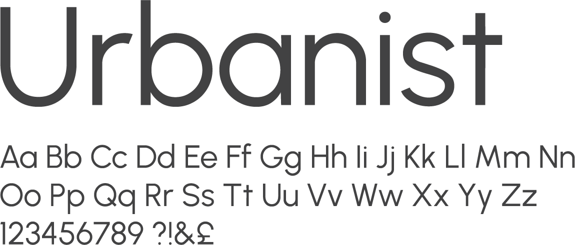
The brand typeface is Gordita – it’s approachable and characterful, making it perfect for a more expressive forms of application.
The main brand font is only licensed to be used within the Design team.
For internal use only. This should already be installed on your work computer.
Colours.
Our brand primary colours are the Dark Sky and Mint to create a recognisable combination. The Off White colour works as a neutral base, highlighting the simplicity of brand, giving a sense of clarity to brand assets.
The text within our brand assets is always set in Charcoal and in Off White as secondary option.
Dark Sky
Pantone: 287 C
CMYK: 100 / 80 / 0 / 10
RGB: 18 / 44 / 145
HEX: #122c91
Light Sky
Pantone: 2727 C
CMYK: 90 / 30 / 0 / 0
RGB: 42 / 111 / 219
HEX: #2a6fdb
Light Mint
Pantone: 3242 C
CMYK: 47 / 0 / 18 / 0
RGB: 129 / 233 / 230
HEX: #81e9e6
Charcoal
Pantone: Neutral Black C
CMYK: 0 / 0 / 0 / 95
RGB: 34 / 34 / 34
HEX: #222222
Mint
Pantone: 3252 C
CMYK: 70 / 0 / 30 / 0
RGB: 72 / 214 / 210
HEX: #48d6d2
Off White
Pantone: 600 C
CMYK: 5 / 0 / 18 / 0
RGB: 250 / 249 / 228
HEX: #faf9e4
Illustrations.
We believe that having illustrations within the Procode brand helps to add a ‘human’ feel. They help communicate complex and technical information in a friendly way. Their style is bold and minimal, and most importantly, diverse.
With the brand colours they add full vibrancy, and they should be accompanied with the brand graphic elements.
Graphics.
Our brand graphic elements all stem from our brandmark.
These dynamic elements give our brand movement and energy, as well as a playful feel. They are used freely at a large scale and with several possibilities, throughout all the brand assets.
Icons.
The Procode icons have a consistent style throughout, mostly made up with two brand colours.
Some icons specifically represent different areas of the business, such as Procode values and products.
Other.
It is important to maintain brand consistency throughout all internal communications. Here are some resources which may be helpful for you.
PowerPoint Presentation Template.
Including a number of mater pages which can be found within the Office Theme, as well as brand colours.
Word Letterhead Template.
This basic Word letterhead template contains company logo and company information.
Backgrounds.
These backgrounds could be used for Teams or your computer background.
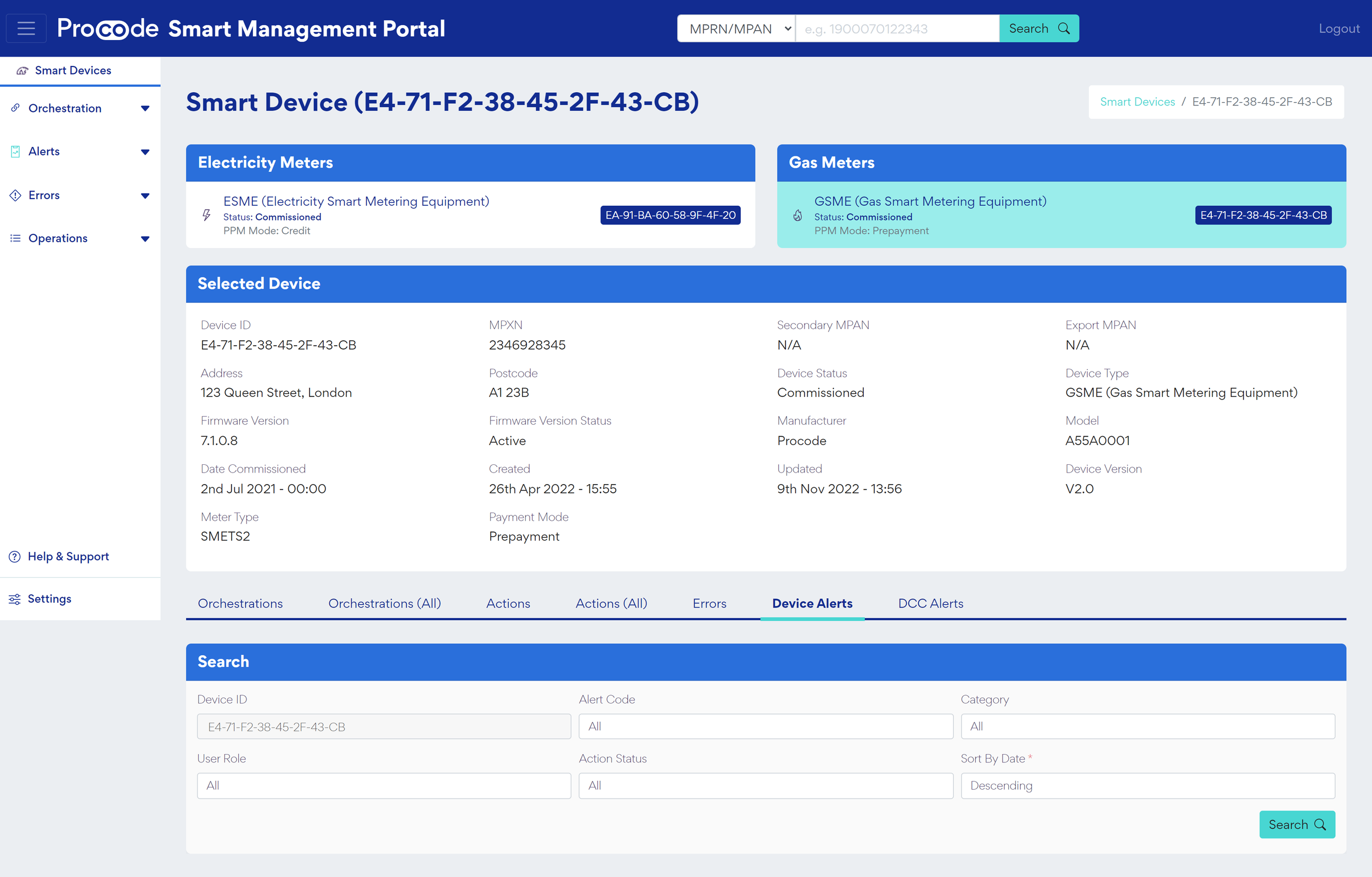
Platform Screenshots.
These mock-ups showcase the various Procode platforms.


